Back
Case Study
Drafty
A regulated UK personal credit line, redesigned around trust — from a five-channel homepage to a four-step application that never reads like a loan form.
Overview
Drafty is a revolving personal credit line regulated by the UK's Financial Conduct Authority, letting customers draw down cash up to £3,000 with no fixed repayment schedule. I designed the full acquisition-to-funding journey: five channel-specific landing pages, a four-step application wizard, the SECCI and e-signature compliance flow, and the confirmation screen that hands users off to the native app.
Role
UX/UI Design
Client
Drafty · GAIN Credit LLC
Industry
Fintech · Consumer Credit
Timeline
2018 – 2019

01
Five doors, one homepage
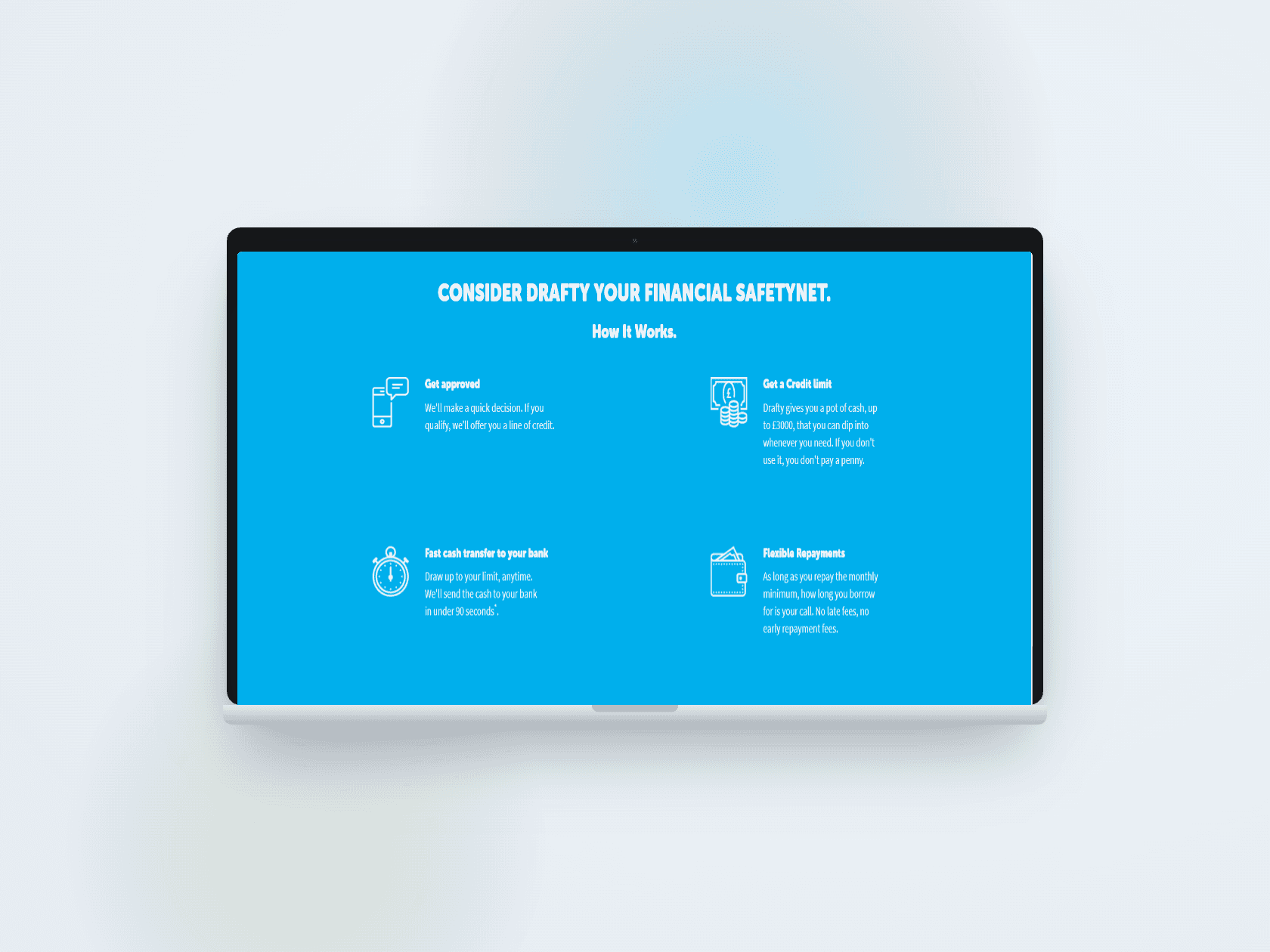
Drafty didn’t get one homepage — it got five. Organic search, comparison-site traffic through ‘HD Credit Matcher’, affiliate partners like Clearscore and Digitonomy, and paid search each landed a visitor with a different level of trust and a different question already half-answered. Rather than design five separate sites, I built one modular hero, headline, and CTA system that could be re-slotted per channel without touching the page’s underlying trust architecture — the ‘how it works’ explainer, the Trustpilot band, and the testimonial carousel stayed constant.
The brief that shaped every decision: this is a short-term credit product competing against the reputation of payday lenders. So the homepage does more reassurance work than a typical fintech marketing page — ‘No fees. Zero. Zip. Diddly squat.’ next to a photo of a dog on a sofa, not a stock photo of a laptop. The tone had to feel more like a friendly local bank than a growth-hacked lending app.

02
A form that never feels like paperwork
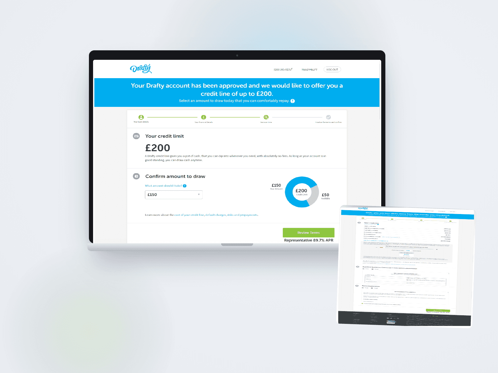
Getting approved for regulated credit legally requires around fifty data points — income, employment, expenses, existing debt. I split that wall of questions into a four-stage stepper (basic details, financial details, decision, terms) with a persistent progress rail, so a user always knows how many honest minutes are left. Inside each step, open text fields were replaced with chip-style quick-select wherever a finite set of answers existed — employment status, pay frequency, expense bands — cutting typing to a minimum for what we knew was a majority-mobile audience.
The parts users trust least — sharing a debit card number, confirming a credit reference check will run, agreeing to a SECCI and a legally binding e-signature — got the opposite treatment: more whitespace, plainer language, and a visible circular chart showing exactly how much of the approved credit line they were about to draw, instead of a wall of numbers.

03
What shipped
The application flow shipped across five acquisition channels and both iOS and Android, sharing one design system so a change to the stepper, the donut chart, or the SECCI layout propagated everywhere at once. At the time of this work, Drafty carried a 4.7-star Trustpilot rating across more than 2,300 reviews and could move approved funds into a customer’s bank account in under 90 seconds.
The clearest lesson was that compliance and conversion aren’t opposing forces in regulated fintech — they’re the same design problem. A SECCI disclosure and an e-signature step feel like friction only when they’re typeset like a legal document; laid out like the rest of the product, they read as one more sign the company has nothing to hide.