Back
Case Study
Say Babyyy
A quiet, editorial website for a newborn and maternity photography studio in Chennai.
Overview
Preethi Hima runs a newborn, maternity, and family photography studio in Chennai, but her online presence was a single Instagram grid competing with hundreds of similar accounts. I designed and built a brand and website that translates the calm, unhurried feeling of her actual photo sessions into every screen — from the first scroll to booking a session.
Role
Brand & Web Design
Client
Say Babyyy by Preethi Hima
Industry
Photography & Branding
Timeline
2026
01
Finding the studio’s voice
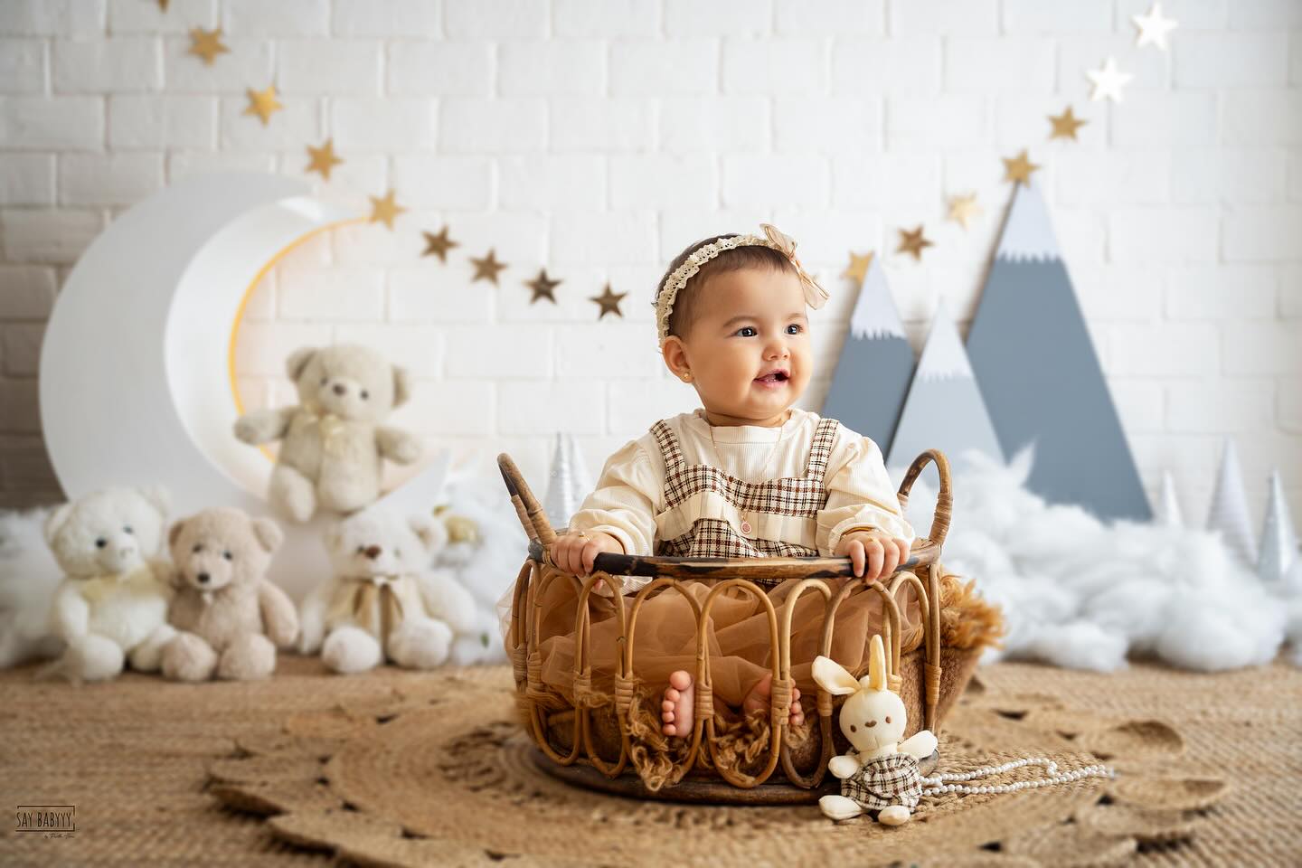
Preethi’s actual sessions are unhurried — long, quiet shoots built around a sleeping newborn’s schedule rather than a shot list. The original online presence didn’t carry any of that: generic templates, stock-style layouts, and copy that sounded like every other photography business page. I spent time with her studio and past client galleries to understand what clients actually remembered afterward, which became the brief for the whole site: soft light, real expressions, editorial pacing.
The name itself, Say Babyyy, is playful and warm in person but risked reading as cutesy online. Serif display type, a muted cream-and-clay palette, and generous whitespace let the name stay playful in voice while the visual system stays composed and editorial.

02
Designing for the scroll, not the grid
Most photography sites default to a dense Instagram-style grid. Instead, the homepage moves like a slow narrative: a full-bleed hero portrait, a short studio philosophy, a curated six-image showcase rather than an exhaustive gallery, and a single warm testimonial before the booking call to action. Every section earns its place instead of competing for attention.
The gallery, about, and booking flow were split into their own pages so a visitor with intent — someone ready to book — never has to scroll past marketing copy to get there. Session categories (newborn, maternity, family & milestones) are presented as a simple three-up choice, mirroring how Preethi actually structures her packages.


03
Outcomes & learnings
The finished site reads as a small independent studio with a considered identity, not a template. Preethi now sends the link directly instead of an Instagram handle when quoting new inquiries, and the booking page gives her a single place to point every conversation.
The project reinforced that restraint is a design decision, not an absence of one — every image removed from the homepage made the ones that stayed do more work.